浮生猎趣

ls *.fun

利用 Python 对 CSV 文件进行数据分析,生成统计图表

| Comments

CSV 文件本质上还是文本文件,只是格式是固定的,所以看起来跟表格差不多。Mac 下的 Numbers 原生支持打开 CSV 文件,也可以进行排序、筛选、统计等操作。不过有一点比较致命,当数据量特别大的时候,用 Numbers 简直痛不欲生,内存涨得飞起,卡得你不要不要的。而利用 Python,处理起来则灵活方便很多。

1. 配置环境

1.1 安装 MacPorts

最简单的方式是使用 pkg 安装。下载安装包,然后双击即可。

macports_install

安装完后要重新开一个终端才能运行,否则会提示 port command not found.

1.2 安装依赖库 numpy & matplotlib

1
sudo port install py35-numpy py35-scipy py35-matplotlib py35-ipython +notebook py35-pandas py35-sympy py35-nose

1.3 测试

1
2
3
4
5
$ python
>>> import numpy as np
>>> np.test('full')
>>> import scipy
>>> scipy.test()

参考 [Mac] Python Numpy Scipy Matplotlib 快速安装

2. 分析数据

如前所述,CSV 文件其实就是文本文件,常规格式如下:

1
2
3
"Header1","Header2","Header3"
"Data1","Data2","Data3"

通过 Numbers 打开,看起来是这样的:

Header1 Header2 Header3
Data1 Data2 Data3
Data1 Data2 Data3

知道了规则,不难用 Python 写出大概这样的代码:

1
2
3
4
5
6
7
8
9
10
11
12
13
14
15
16
17
18
19
20
21
22
23
24
25
26
27
28
29
30
31
32
def main(input_file_path):
  input_file = open(input_file_path);

  # skip header
  input_file.readline();

  datas = [];

  key_index_table = {
  "Header1": 0,
  "Header2": 1,
  "Header3": 2};

  count = 0;
  max_count = 10000;
  while count < max_count:
    count += 1;
    line = input_file.readline();
    if not line:
      break;

    values = line.split(",");

    data = {};
    for key in key_index_table:
      value = values[key_index_table[key]];
      value = value[1:-1]; # remove quotation mark
      data[key] = int(value);

    datas.append(data);

  drawTable(datas);

所有的数据都读到了 datas 数组中,下面是对这组数据进行绘制。

3. 绘制图表

1
2
3
4
5
6
7
8
9
10
11
12
13
14
15
16
17
18
19
20
21
22
23
24
25
26
27
28
29
30
31
32
33
34
35
36
37
38
39
40
41
42
43
44
45
46
47
48
49
50
51
52
53
54
55
56
57
58
59
60
61
62
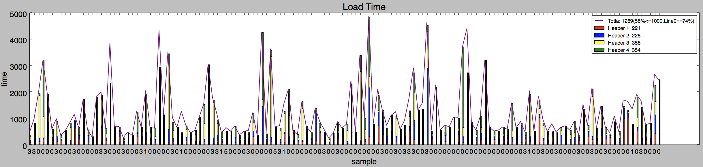
import numpy as np
import matplotlib.pyplot as plt

def drawTable(datas):

  data1_list = [];
  data2_list = [];
  data3_list = [];

  avg_data1 = 0;
  avg_data2 = 0;
  avg_data3 = 0;
  less_than_1000_count = 0;
  total_count = len(datas);

  for data in datas:
    data1 = sample["Header1"];
    data1_list.append(data1);
    avg_data1 += data1;

    data2 = sample["Header2"] - data1;
    data2_list.append(data2);
    avg_data2 += data2;

    data3 = sample["Header3"] - data2;
    data3_list.append(data3);
    avg_data3 += data3;

    if sample["Header3"] <= 1000:
      less_than_1000_count += 1;

  avg_data1 /= len(data1_list);
  avg_data2 /= len(data2_list);
  avg_data3 /= len(data3_list);

  data1_np_array = np.array(data1_list);
  data2_np_array = np.array(data2_list);
  data3_np_array = np.array(data3_list);

  idx = np.arange(total_count) * 2;
  width = 0.5;

  plt.figure(figsize=(10, 5));
  plt.subplots_adjust(hspace = 0.3);

  fig = plt.subplot(2, 1, 1);
  fig.set_title("Load Time");

  fig.bar(idx, data1_list, width, color = 'red', label = "Header1: " + str(avg_data1));
  fig.bar(idx, data2_list, width, bottom = data1_np_array, color = 'blue', label = 'Header2: ' + str(avg_data2));
  fig.bar(idx, data3_list, width, bottom = data1_np_array + data2_np_array, color = 'yellow', label = 'Header3: ' + str(avg_data3));

  fig.plot(idx, data3_list, color = 'purple', label = 'Total: ' + str(avg_total_time)  + "(" + str(int(round(100 * less_than_1000_count / len(total_time)))) + "%<=1000" + ")");

  fig.set_xticks(idx);
  fig.set_xticklabels(line_index, rotation = 0, fontsize = "small");

  fig.set_xlabel("sample");
  fig.set_ylabel("time");
  fig.legend(loc = "upper right", prop = {"size": 8});

  plt.show();

效果如图:

numpy_example

原文作者: lslin
原文链接: http://blog.lessfun.com/blog/2017/05/11/use-python-to-handle-csv-file/
版权声明:自由转载-非商用-非衍生-保持署名 | Creative Commons BY-NC-ND 3.0

发表评论